Tuesday, 9 November 2010

Idea's for post design...

Personally I really like the colour palette and several objects within this design. I feel it would be befitting to my topic, I may try this template and see in which ways I can adapt it to be my own, and benefit my products purpose.


I like the simplicity of this. My design could be so simple, just an opening envelope, revealing a design. I'll keep this in mind, that in some situations, its best to keep designs simple in order to gain a strong response.

I wanted to make mine wither 3d, or in the form of a box. I like the simplicity and effectiveness of this design, and how it relates to the product its selling. I could do the same, relating to symbols of my topic.

I feel this is quite ethnic and religion-esk (forgive my making up of words), the colour palette in itself expresses this, along with the religious symbol cut out. I could take these elements into consideration when producing my designs and products.

I like the little hidden elements to this design, and the way in which it's done this, not being too complicated, its still simple in it's appearance.

I'm going to try this idea; a grid form revealing an image. I think i'll produce a more complex design, in which the movement of the image behind the grid reveals a range of images rather than just one. 

I like the cover in particular, and its envelope appearance. 


Monday, 1 November 2010

No news is good news - Relevant article

http://www.journal-online.co.uk/article/5475-student-christian-conversion-on-the-rise

I found a relevant article which might prove useful when it comes to gaining opinion. It's a contrast to what i'm looking at as it states more students are converting to Christianity than ever before.

It goes on about the 'alpha movement', which has been designed for non church goers, has been embraced by Edinburgh's students.

So, what is graphic design? Take 2

Graphic design...is the effective delivery of a message, idea or concept through the use of visual language.


It delivers the message well, to promote. I'm a real fan of vintage and classic graphic design - This I consider to be just that. I love the subdued tones, and the use of painting in comparison to print. The hand rendered element I feel I love best here, basically everything is produced, in one way, shape, or form by hand. In this case, painted. 


Theres something about the combination of alot of very small text, with very detailed illustrations I just love - It has the appearance of a personal sketchbook, a personal piece of work and doodling. Which just goes to show, some peoples doodles, are others considered graphic design. I have a love for the biro pen too, the breadth of detail created from such a restricted medium is brilliant.

Again, a handmade piece. In a vast range of gritty materials and mediums. The like this best due to the 'grunge' appeal. Its no a precise piece of work, its been created in a collage like style. This is one of my favourite pieces of graphic design i've ever seen. Its just unique.

The layering of hand drawn text on photos has been a technique and style i've used a lot myself. it's simple, yet, effective. This piece looks like a scrap book, of places visited, which an opinion or comment on the place, drawn on top of the photos taken.


This is appealing to me, particularly because of the colour palette and chosen materials. Monochrome is wonderful to work in, especially when working with newspaper, print and photos. Its a nice variety which works well together. The use of red, really highlights the textures, and monochrome colour pallette due to its vibrancy. I can't quite pinpoint why I like this so much...

This was the layout of a webpage, Images shown within a polaroid style border, suggesting a scrapbook like appearance, which, as said before, is a love of mine. I like when work feels personal and unworked, yet gives a professional finish.

Another piece screaming 'Personal scrapbook!' Again another piece using doodles, a lot of small writing and a variety of texts, colours and images to create an intricate interesting piece.

Simple yet effective. A quote possibly used too much by myself, but a design which can do so, I grow to love. The hand rendered tree and consistency through products works well due to the simplicity of the design and type. The brown, aged colour palette is a favourite of mine, and here its gives a 'earthy' quality to the products, referencing the illustration of the tree.

Here I like the range of materials that have been used, creating a variety of textures, colours and an interesting aesthetic appeal. This person has used sewing - in an intricate detailed form, embossings, and printmaking within all the pieces. To then layer these I feel is ingenious.

Another design using hand rendered type over photo. A variety of line thicknesses, fonts and a quirky illustration works when in attracting an intended audience of young people.


This is different to other pieces i've looked at. Its colour palette is nice due to its pastel qualities paired with the contrasting use of black and white. I really like the different uses of type. The illustration itself has a foreign feeling about it which is very subtle but quite nice. Again all these points are relevant for the image below.


The simplicity is something I like here. Simple type, simple pattern, does what it needs to do. The range of line thickness is complimentary in highlighting the detailing.

Absolutly love this design in a book. In handmade, holds vintage qualities, has a personal touch and looks aged. Pretty much holds everything I like.


I'm liking the whole 'product in a box' going on here. Not sure I like the designs themselves, but I really like the presentation of them being in a cardboard box.


No news is good news - Poster research

This is a magazine cover for 'newsweek' which is communicating the same article I am of the decline of christianity. I like the simplicity of it, its quite strong. I like the idea of creating a symbolic image to the religion out of suitable typography and will experiment with this.

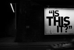
I like this, it could be relevant to produce the design with image and type. It's use of naturally lighting and quite a gritty scene i feel would suit my article headline; as its a topic which could be seen as controversial , not many people would want to talk about it; this design would give a dark, edgy element to it.

100_0454.JPG.jpg

I really like the hand drawn qualities of this, I came up with the idea of drawing a cross, in relation to christianity, but found this image and thought it would be good to be drawn in a tree like form. I'l attempt to give it the print like quality this image holds.


No news is good news - Design principles

We were given these words and their definitions today:
  • Visual Metaphor - Transfer the meaning from one image to another. The metaphor conveys an impression about something relatively unfamiliar by drawing a comparison between it and something else.
  • Synecdoche - Applied when a part is sued to represent a whole. e.g statue of Liberty = NewYork
  • Metonym - Symbolic image eg a cross = Church, when two images bear a close relationship, it doesn't translate characteristics.
Once we knew what they were, we had to make our own example up for each.

Visual metaphor - That girls hair looks like spaghetti

Synecdoche - Monaco casino = Monte-Carlo France

Metonym - image of smile = Dentist

No news is good news - What next?

Throughout my research I came across some information about how some Churches in England are being converted to Mosques. This is down to the low congregation sizes within particular churches, so much so, other religions are using building of worship, into relating to their own to hold services. I thought this would be a really interesting topic to research more in-depth. I began by finding key words relating to this. Heres are some, along with definitions:


Dictionary definition:
Deconsecrate - To remove the consecration from a church or a similar building.
Consecration - The act or ceremony of consecrating; the state of being consecrated; dedication.
Dedication - A ceremony marking an official completion or opening.   - The deliberate or negligent surrender of all rights to property.
Sacrament - A sacred act or ceremony in Christianity. In roman catholic theology, a sacrament is defined as "an outward sign instituted by christ to give grace.
Unction - A religious or ceremonial anointing 

No news is good news - Research found

Relating articles:
Within the Daily star, underneath my chosen article I found a phone in debate, which was labelled "IS BRITAIN BECOMING A MUSLIM STATE". It would be interesting to find out the results and possibly some comments on this.

Another article found was the top ten listing of boys names, ethnic asian influx has had a massive impact on these results, the top boys name within England and Wales is 'Mohammad' (all spellings) which is renowned as being an islamic name, showing how culture is changing, even within the names of people.


Bradford - 2nd most Muslim populated city outside of London
With such a significant Pakistani population, Islam has become prominent throughout Bradford. This is particularly the case in the inner city areas such as Manning-ham, where a majority of the population are Muslim. Accordingly, there are a substantial number of mosques - some where converted from churches or other buildings, others where purpose built. (Could find research for conversion of religious building) A mosque in the city even won the model mosque award. 

There is also a sizeable indian immigrant community, also significant Hindus in area. There was a Hindu temple built which is the largest in northern England. Many Sikh related festivals are celebrated within the city annually.

Over the years, most of the Jewish population have migrated to Leeds. The Jewish community in Bradford was strong in the 19th century.


Facts and Figures:

Parish numbers - 13,500 in 2000
 -    8,700 today

Muslims who attend mosque weekly - 20,000

No religion in UK - 31% to 43% between 1983 and 2008

Those who are Christian in UK- 66% to 50% between 1983 and 2008

37% British sceptical

25% Believe in god in UK

Member of Church of England - 40% to 23% between 1983 and 2008. 49% of this group never attend services, 8% attend weekly.

62% in UK never attend a religious ceremony - 42% questioned are against any form of faith school.

52% agree that - "BRITAIN IS DEEPLY DIVIDED ALONG RELIGIOUS LINES"